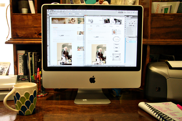
Why the redesign? Well, I finally got around to redesigning my website and wanted them to have a similar look. For those that are new to this blog, I'm a graphic designer turned work-at-home-mom-freelance-designer. I love being able to be at home with my girlie and still have a creative outlet in the freelance world. Check out my website to find out more about what I've done, what I do and to see some of my recent work. I'd love to hear what you think.
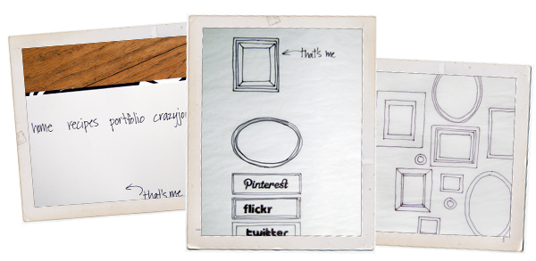
One of the things I love about design is the concept stage. This is when a client comes to me with a name/idea of their business and need me to turn it into something visual. I sketch, sketch and sketch various ideas before narrowing them down and turning them into computer generated graphics. I love the hands on part of this step and wanted to communicate that throughout my website.
I drew every single graphic, logo, poster and photo for thumbnails. Like I said folks, this was my labor of love. I really love how the rollovers turned out on the site. Once I had it all up and running, I scrolled around for several minutes just watching the sketches switch to graphics.
Once I finished my website, it was time to redesign my blog. I really liked the feel of the old design: soft, girly and clean. And not that I'm not any of those things (those of you that know me giggle here), I just wanted a change and I wanted it to have the same feel as my website.

Here's a quick rundown of the changes, starting from the top.
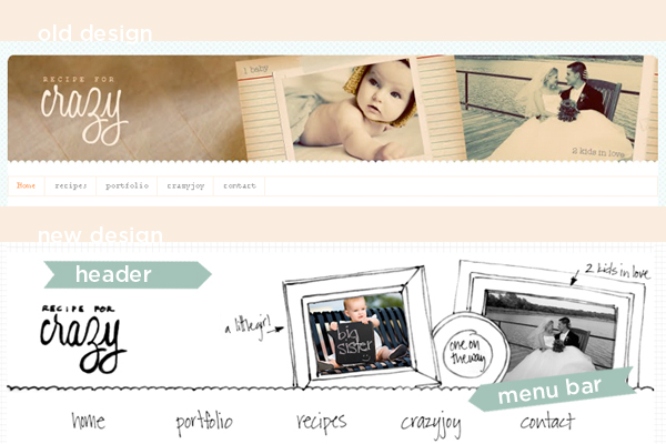
New hand-drawn header and menu bar.
- I sketched out the frames, title and added some color photos to give it a little warmth and color.
- I also wrote out the menu and
scanned intook pictures of each word and uploaded them for a completely custom menu bar. - I also changed the background to a grid pattern I created in photoshop that matches my website.

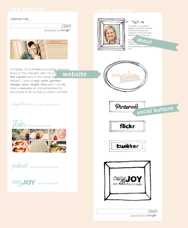
- I sketched out several different frames and used those for all the sidebar links
- I updated my website link to include the logo
- I sketched out each of the social network logos for pinterest, flickr and twitter
- New buttons for crazyjoy challenge and button for my blog
- I also moved the search bar down so it's not at the top
That about sums up the changes. Now that I have all that set up I'll probably work on adding some rollover effects to match my website. What do you think?


Girl, I am impressed that you sketched it all out. Awesomeness. I think the rollovers would be awesome for your blog! It would def. be consistent to your website although it pretty much is! If we lived closer, you could be a part of our Operation Dumbo Project that me and a couple of graphic designers have started! I'll tell you more in an email!
ReplyDeleteI love it! Looks great Leslie!
ReplyDeleteyour new layout looks wonderful! i love all of the personal details that you did yourself. love it all!
ReplyDeleteWow, looks great!!!!
ReplyDeleteWow, looks great!!!!
ReplyDeleteHey Lesley! I love the new website/blog design.
ReplyDelete